

How We Repositioned an NFL Brand to Represent the Pride of Atlanta.
Even the most established brand must reinvigorate its fans and followers. After 17 years without a uniform change, the 2020 season presented an opportunity. The Falcons rebrand and uniform update reconnected the team with the fanbase and ushered in a new era of Atlanta football.

Client: Atlanta Falcons
Uniform Design / Brand Positioning / Creative Strategy / Visual Identity
Challenge
As Executive Creative Director, it was my was duty to shepherd all stakeholders through the uniform design and brand identity evolution – from the Falcons C-Suite to our partners at Nike and the NFL to my own creative team – and ensure that the end product staked out a new, exciting position for our brand but rang true to our identity.
Solution
A clean and intentional design that boldly marks a new era of Falcons football. The new uniform modernizes the brand, delivers on fan feedback, and overtly connects the team to the city, serving as a badge of pride for all Atlantans.
Results
The new designs exceeded fans’ and players’ expectations, modernized the brand, and generated $1.6M in jersey sales in just the first 6 days – breaking all previous team retail records.

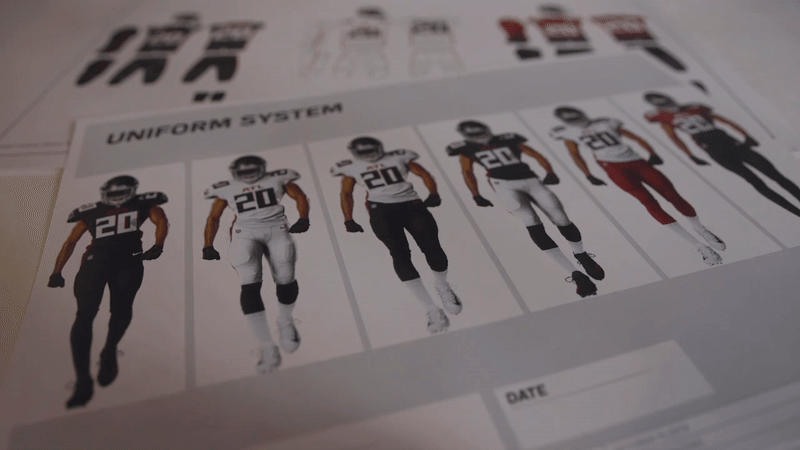
Four unique jersey styles with seven color combinations including the 1966 throwback.

Section 1:
UNIFORM DESIGN
The new uniforms needed to feel at home within the state-of-the-art design of Mercedes-Benz Stadium while still feeling viscerally like the Atlanta Falcons had come to know and love.
Over the course of 18 months, I was embedded with the Nike and NFL teams orchestrating the uniform design process to ensure the fan's voice was actualized in the final design.

A Fan First Approach
Our process started with getting a deep understanding of what fans wanted.
We analyzed nearly 20 years of fan and player feedback data.
Falcons Uniforms 2003-2019
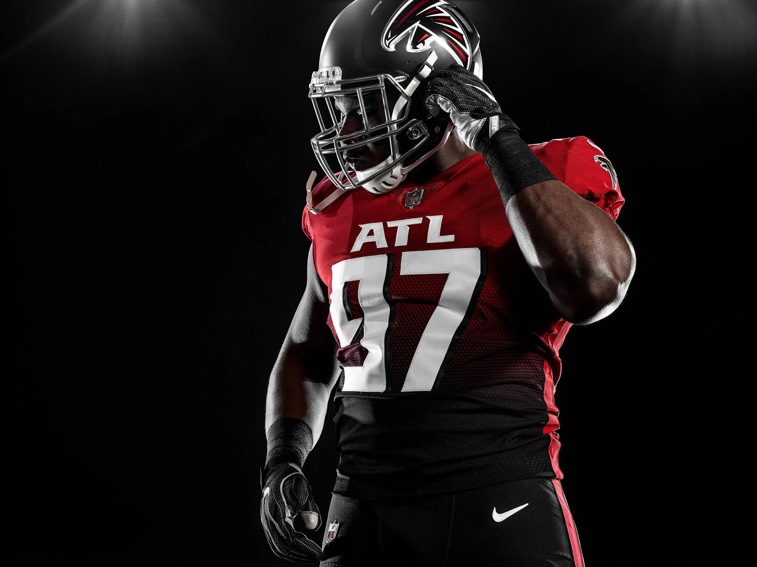
Own Red. Bring Back Black.
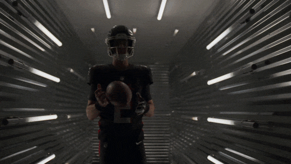
Black and red uniforms have been a part of the Falcons since they first stepped on the field in 1966, but when it came to feedback both players and fans made themselves heard loud and clear. Players told us black uniforms make them feel powerful. Their common request? Bring back black home uniforms.
“There’s just a feeling to it I can’t explain when you see that color [black] in your locker.”

Atlanta Falcons QB // Matt Ryan
We brought back black home jerseys giving the players and the fans what they wanted.
We also reintroduced the classic 1966 jerseys – a nostalgic fan favorite.
( L: Home / R: Classic )
Red is used strategically to draw focus to the uniform's critical visual elements.
01 Falcons Logo
02 ATL Logotype
03 Number Drop Shadow
04 Stoop Graphic

Honor the Past. Harness the Future.
We ensured the uniform design was authentic to Atlanta and the team’s history by leveraging aspects of the past to inspire key design elements.
THE STOOP
The stripe down the uniform's side, inspired by the speed, precision, and simplicity of a predatory falcon attacking unsuspecting prey and re-imagined as a graphic extension of the team's logo.
Rise Up jersey
targets the next generation of fans.
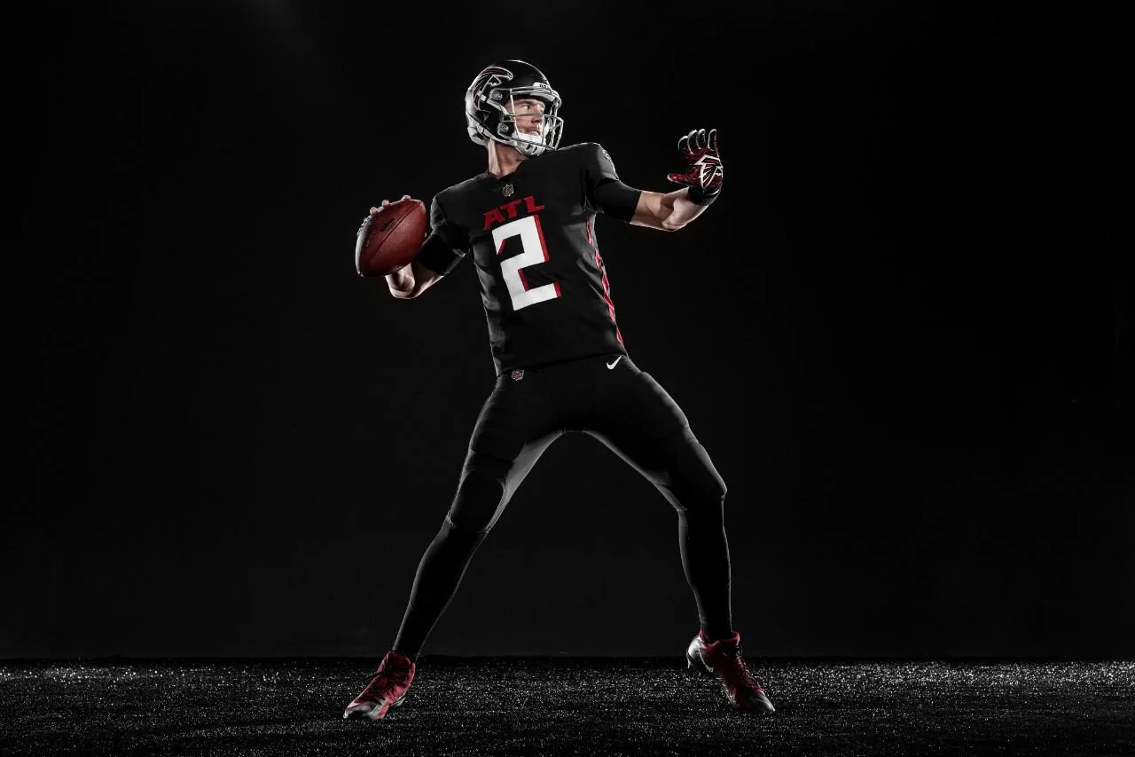
To reach youth, we had to introduce something the NFL had never seen before. We did that with the Rise Up gradient uniform.

RISE UP GRADIENT
Honors the city's historic resurgence – Atlanta as a city that rose from the ashes twice – through a visual pattern made from the official Falcon logo's eye.
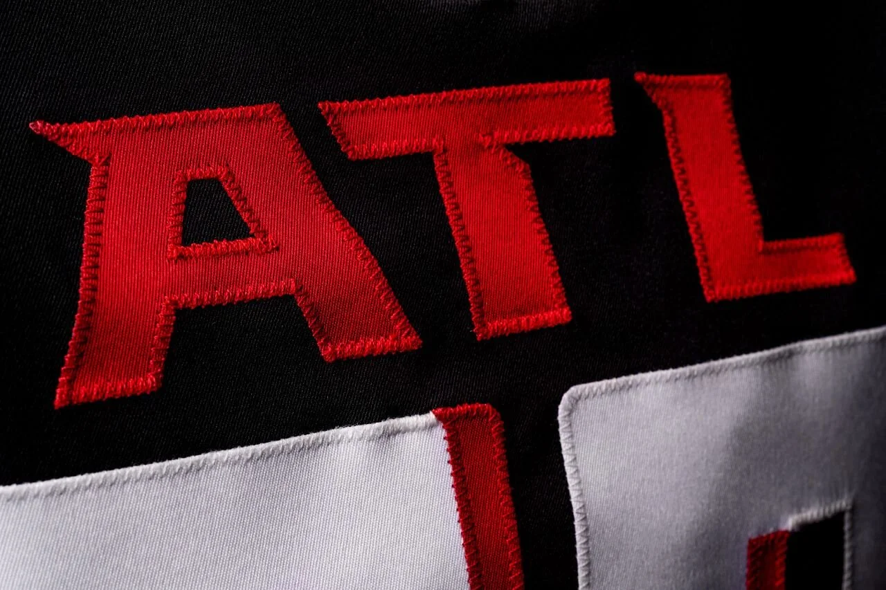
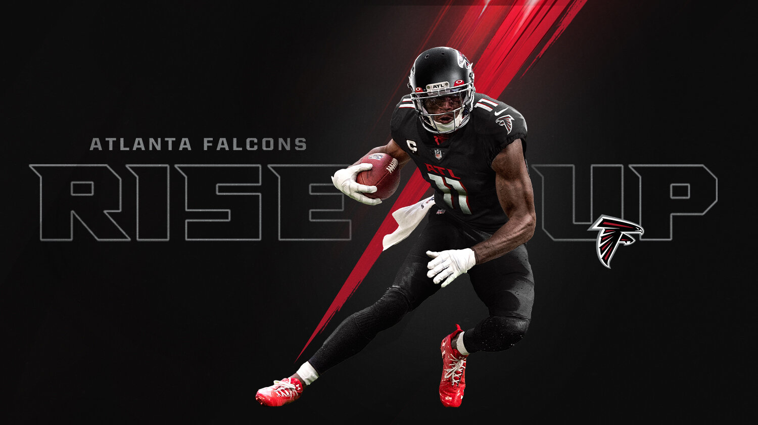
We overtly connected the team to the city.
Our love for Atlanta is sewn into the team's fabric, proudly and prominently across each player's chest.
The new ATL logos celebrate unity between city and team.
Atlanta is more than a city the Falcons play in. It is of unique culture, personality and stories. It is a badge of pride,
In this AtlantaFalcons.com feature we spoke with Atlanta influencers including Deon Sanders, Ludacris and Mayor Bottoms to understand what makes Atlanta special.


There are a lot of people in this city that ride for the Falcons, and we want to let them know that we're riding for them, also.
Deion Jones // Atlanta Falcons LB
speaking about the new ATL jersey.
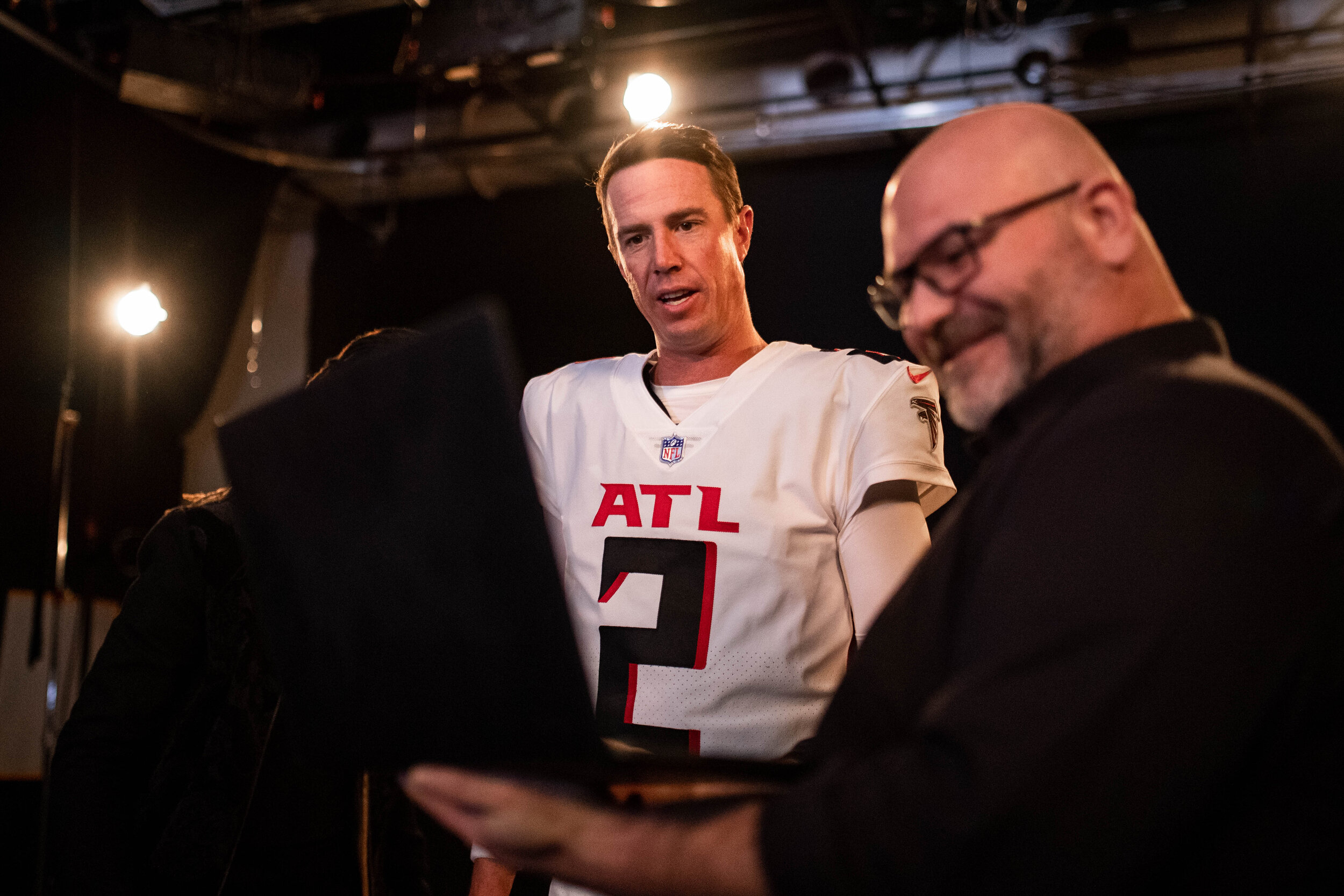
THE ATL
UNIFORM COLLECTION
On Wednesday, April 8th, we unveiled the new visual identity and the first comprehensive redesign of the team’s uniforms in 17 years.

The NFL’s First Gradient Jersey.
We understood that to connect with the next generation of Falcons fans, we needed to design something the NFL has never done before.
We did that with this jersey.
Logo decal 30% larger
Chrome facemask.
ATL logo on the front bumper
Sleek Modern New
Helmet Design.
The new helmet design mirrors Atlanta’s swagger, featuring a sleek matte black finish contrasted by a 30% larger metallic logo decal and chrome face mask.

Additional color combinations can be achieved by combining different pants and jersey colors.

Home All Black - Front

Home All Black - Back
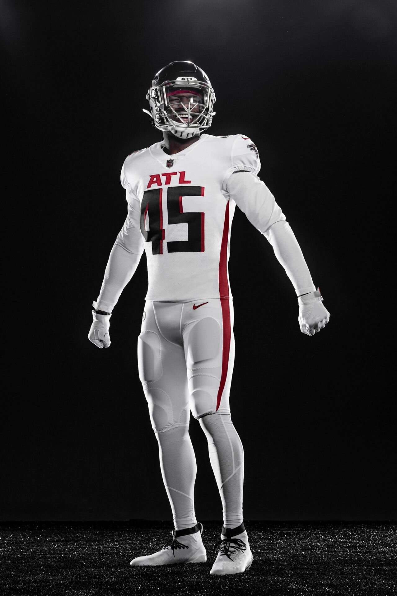
Away All White - Front
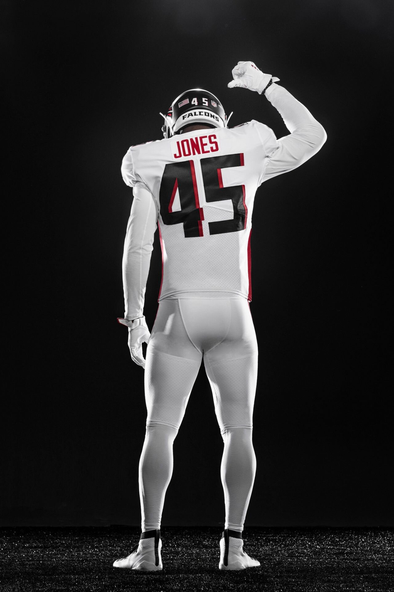
Away All White - Back

ALT Rise Up Gradient - Front

ALT Rise Up Gradient - Back

Throwback - Front

Throwback - Back

$1.6M
Jersey sales drove $1.6M in six days, making it the biggest online sales day in team history.
Sports Business Journal Article

Section 2
BRAND IDENTITY
On a parallel path to the uniform design, I orchestrated the Falcons in-house teams to redefine the Brand DNA and Design Language.
Through cross-functional collaboration with the brand and communications groups, we authored a new Brand Identity Playbook including redefining the brand vision, mission, messaging, voice, and tone.


Modern. Bold.
Focused. Youthful.
The evolved design language is grounded in the uniform design, staying true to the elements that anchor the team to the city.

Anatomy of a core brand asset as defined in Brand Playbook
A precise, common ‘language’ is applied, enabling those ways in which the brand will be consistently executed across all media and platforms.
Black as base color
Red to call attention to areas of importance and primary messaging
“Larger than life.” subjects remain unobstructed and compositions uncluttered
Compositions that highlight the ATL on the chest or helmet
All creative must be qualified by a primary logo if it is not visible on the helmet or jersey in photography.
New Logos + Marks

Graphic Elements
In addition to the team logos, we have identified a key set of visual triggers within our design language to evoke a sense of familiarity through a direct connection to the team’s new on-field look.
Rise Up Gradient Pattern: Represents a city on the rise. Used to amplify gradient themed games and retail items.

Stoop Graphic:
Represents speed, precision and aggression

Throwback Stripes:
A direct link to the uniforms from our past. Used to reference throwback games and historic content.

Type Designed to Complement the Team’s Uniforms and Graphic Elements.
Working with NFL art directors and type designers, we evolved the team’s official brand font to set the foundation for a new collection of official team logos.
We created symmetry between the official brand font and the jersey numeral system.
“Wingtip” A Modern Brand Font
The Falcons had equity in their current brand font, but it had become dated and limited by its lack of versatility. Our approach was to maintain the identifiable attributes of the current font while strengthening letterforms.
New brand font “Wingtip” core letter forms
Evolved Logotype
Tighter letter spacing, bolder and sharper letterforms and aeronautic notches in the counter spaces provide a more versatile and aggressive logo type
Jersey Numerals
A tight radius at the corners, sharp talon-like terminals, and a refined drop shadow resulting in a clean and legible system that reflects the city's modern architecture.


Bringing It All To Life.
With a clear vision for the new brand identity, I worked with the internal stakeholders to develop a robust two-day content capture and creation plan to fuel the media release.


Heroic. Dynamic. Authentic. Immersive.
Imagery that tells the right story.


1.3B Media Impressions
More than 150 editorial and broadcast placements were secured for a total of 1.3 billion media impressions.
Media highlights included Associated Press, ESPN, CBS Atlanta, Fox 5 Atlanta, CBS Sports, New York Times, and USA Today accounting for over $16M in ad impressions.
ESPN.com

Uniform Release Anthem Video
Working with digital agency Burn and Broad, we brought the stoop to life as a motion design element that serves to amplify energy moments throughout the season.
Record-Setting Digital Audience Consumption and Engagement
“The Falcons generated some of the highest traffic numbers we've seen for their club web and mobile app with their uniform reveal!”
- Per NFL League Office / NFL Social


In Stadium Examples


Out-of-Home Examples


Retail Examples


Results
Under my direction, we evolved the Falcons Brand DNA to introduce sleek, clean, bold, and youthful uniform designs that connected with the team’s past but are laser-focused on the future.
The new designs exceeded fans’ and players’ expectations, modernized the brand, and generated $1.6M in jersey sales in just the first 6 days – breaking all previous team retail records.

“I absolutely love them.”
NFL Hall of Famer Deion Sanders on the Falcons new uniforms.